Ditto
A Self-Care and Mental Health App for Young People
UX RESEARCH | UX DESIGN | UI DESIGN
UX Design Team: Yazhen Liu | Bonnie Seto | Abby Wilkinson
The total number of young people who experienced depression increased 59% between 2007 and 2017.
Through learning about and understanding this critical problem, one way we were inspired to support and help alleviate this burden, was in the creation of an app focused on self care and mental health for young people.
OPPORTUNITY
Today, young people don’t know how to easily deal with the pressures of everyday life and the stress it creates.
They often feel guilty when taking a mental break, due to a cultural environment that enforces a “do-more-than” and a “be-better-than” mindset. We wanted to create an app that was both easy and intuitive to use, while hopefully being able to help to alleviate this heavy burden.
SCOPE OF WORK
Our team was tasked with designing an MVP of a native iOS app in the self-care and mental health market. We decided to focus on reducing the stigma of asking for help and teaching people how to deal with their emotions in a healthy way starting from a younger age. We wanted to create an app that was both easy and intuitive to use, while hopefully being able to help to alleviate the heavy burden of struggling while seemingly alone.
BUSINESS PARTNERSHIP
As part of this project, we were tasked with proposing a hypothetical business partnership for our app.
We thought that by partnering with a business that already appeals to young people would be a great place to start our journey. A prime candidate for reaching millions of young people and helping us in our goal of easing these issues was Teen Vogue.
By partnering with Teen Vogue our app will gain a unique and focused user base — young people who are looking to better themselves and the world around them. Together, we will be able to reach and educate a wider audience of people.
RESEARCH
RESEARCH TECHNIQUES: BUSINESS ANALYSIS, USER INTERVIEWS, USER PERSONA, JOURNEY MAP
Our goal of research was to gain a better understanding of how young people currently maintain and strengthen their mental health, by asking our user base (Millennial + Gen-Z) questions centered around how they cope with stress, what they do for self care, and how they currently vent their emotions.
“A lot of the time just saying it out loud helps clarify things or helps you realize how you even feel about it.”
“I [learned] through trial and error because I used to be really bad at lashing out. That was how I coped with my emotions, just externalizing everything and lashing out.”
“[the counseling center] was very understaffed and had a three month waitlist...a bunch of people were seeking their resources, myself in eluded. All of us got really frustrated.”
“It sucks when you don’t feel like you can communicate with the world, or you don’t feel like there’s anything or anyone to engage with.”
To further understand our target audience we created a persona, Bay, to use as a touchpoint going forward.
Bay is an incoming college freshman worried about the stress of college life. She is in need of a safe and supportive place to commiserate with her peers.
BAY
18 | INCOMING COLLEGE FRESHMAN
Pain Points
When overwhelmed, has ineffective coping skills
Doesn’t know people going through similar situations who she can talk with
Goals
Feel less insecure about new experiences
Mentally prepare herself for college
Needs
Learn how to cope with her anxiety
An outlet to vent her frustrations
PROBLEM
Young people need an easy to access outlet for caring for their mental health.
Bay, a young adult, feels anxious and stressed about transitional periods in her life. She needs a safe and supportive way to learn how to deal with these changes.
How might we support Bay in learning healthy and effective ways to cope with her emotions?
RESEARCH INSIGHTS
Based on our research, we were able to synthesize the data we collected through user interviews into categories that we used to create features of our MVP concept.
DESIGN
Ditto is a safe and fun space to track and vent your emotions while receiving the support you need in an app based community. We chose the name Ditto because it literally means “Same here!” It implies a sense of companionship while being casual and friendly.
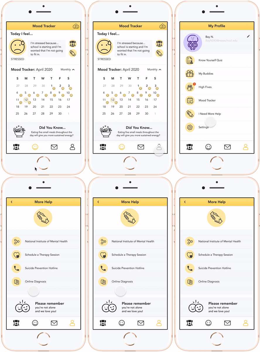
Mood tracker for user imputted daily emotions + journaling
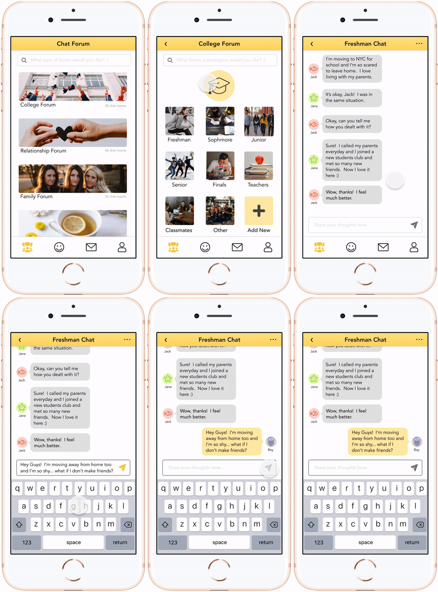
Topic based chat forums for peer to peer sharing and support
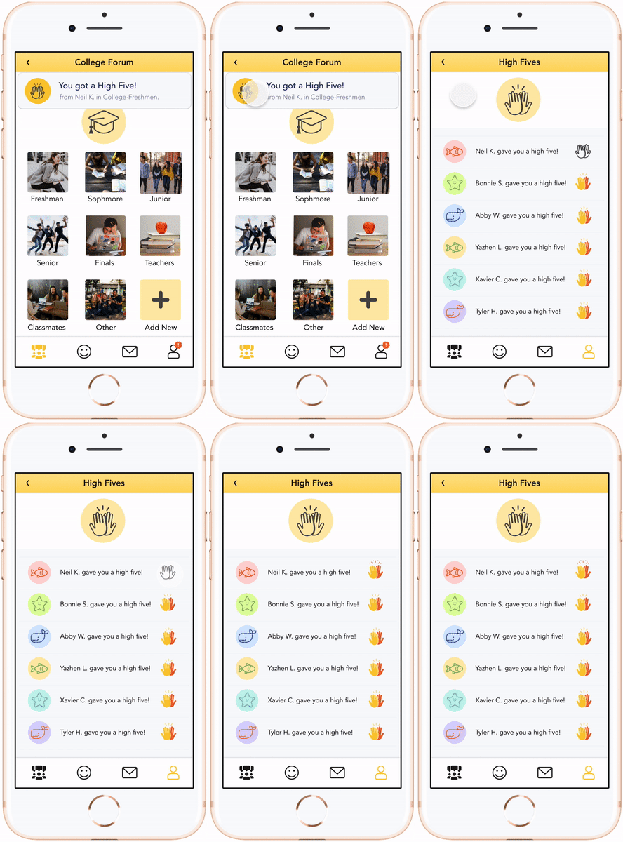
“High-five” feature that allows users to send and receives high-fives of support
Ability to easily find professional help when needed
Our team created a set of principles to further define Ditto’s mission
Create a supportive community for young people
Promote peer-to-peer sharing while staying positive
Teach users fun methods of caring for themselves
Help users to learn about their emotional patterns
Make mental heath, and asking for help, stigma free
Our team put a lot of thought into the visual design of Ditto, in addition to the UX. We used happy colors to signify a lighthearted and positive mood, avatars that provide privacy while being fun, and rounded edges throughout the visual design to make the app feel more friendly and to convey a sense of joy.
PROTOTYPE
TRY ME OUT!
TESTING
We tested three of Ditto’s key features in two separate rounds of testing to validate our design choices — once with a mid-fidelity prototype and then with a hi-fidelity prototype that we designed based on feedback from the first round of testing.
We tested the users ability to intuitively complete the following tasks in both mid-fidelity and hi-fidelity rounds:
Input an emotion and adding it to the tracker
Find a student forum and participate in a chat
High-Five a buddy back within the app
5/5 users tested completed all three tasks successfully in both rounds
TAKEAWAYS:
100% of users completed the tasks successfully in both rounds of testing
MVP features were thought to be useful and brought delight to users
LOOKING AHEAD
Based on the core features we designed into, our app would rely on other technology to make it more convenient for users. By implementing Google API, users would have an easier time logging in to the app, finding therapists close to their location, and through a plug in partnership with Co-Star, receive more fun facts from other apps. We’d also like to partner with the National Suicide Prevention Lifeline chat + call feature for when professional help is needed.
We look forward to proposing and collaborating with Teen Vogue on a partnership, and we aim to launch Ditto during National Mental Health Month, which occurs in May every year. By introducing Ditto to the market, we hope that the depression and stress levels of young people will drop significantly.


