


Guggenheim’s Information Architecture Redesign
Taking a Modern Museum’s Navigation from Confusion to Clarity
UX RESEARCH | UX DESIGN | UI DESIGN | Information Architecture
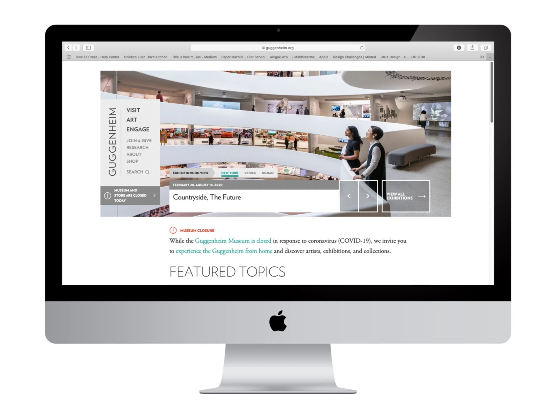
At first glance, the Guggenheim website looks fun, sleek, and modern. It has a lot of interesting resources for visitors to access and beautiful images of the works in their collection.
But, upon closer inspection, it’s difficult for the visitors to the site to navigate to find what they’re looking for.
OPPORTUNITY
The Guggenheim values preserving and collecting modern and contemporary art, and educating the public about the pieces and artists within their collection. They’ve created many ways for visitors to learn about and enjoy their collection—either through in-person visits to the museum, or through their online educational platforms.
After inspecting their site, it became apparent that their navigation made difficult for visitors to the site to know how to get where they need. Vague primary navigation verbiage and a menu that is located on the left of the screen are just the tip of the iceberg.
SCOPE OF WORK
Our team was tasked with redesigning the Guggenheim’s information architecture. We wanted to keep both the Guggenheim as a business in mind, as well as the users who will be visiting the site before or after going to the museum when redesigning — thinking about what they would expect to be able to find and where they would expect to find it on the site.
EXISTING SITE
To evaluate Guggenheim’s current site, we created a sitemap of the primary, secondary, and tertiary navigation to see where the site’s pages were located in a hierarchy. Through this, we were able to analyze the existing navigational structure before creating our proposed edits to the navigation.
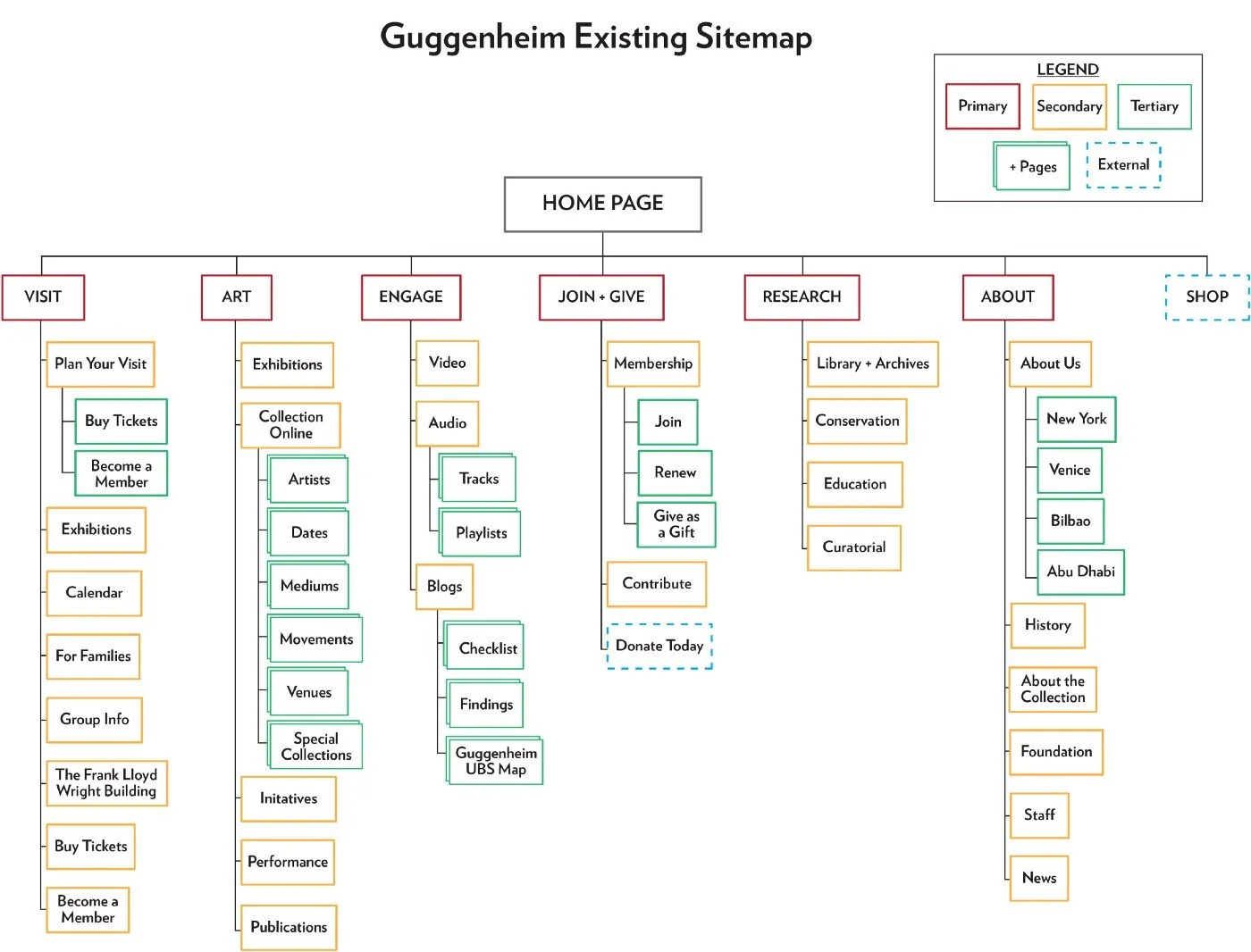
After going through each of the pages of the site’s navigational structure, we realized that the site’s verbiage and way of organizing pages in the expanded menu can be potentially changed to help users find the important things they’re looking for in a faster, less confusing way.
PERSONA
To help us with our testing and to get to the root of the issues with the Guggenheim’s existing navigational system, we created a representation of our target audience.
Florence is a student who enjoys discovering new artists. She uses the Guggenheim’s site to find ticket prices, see what is currently on view, and to explore artists that they have in their collection.

FLORENCE
22 | ART STUDENT
Pain Points
Unaware of upcoming exhibits
Doesn’t know what artists are currently on display
Goals
Discover new artists + art forms
Align her busy schedule with the current exhibition times
Needs
To find admission, hours, and contact information
To know what’s currently on exhibition
PROBLEM
Museum guests often need a quick and straight forward way to access information on the Guggenheim’s site before or after visiting.
Florence likes to explore new cultures through learning about new artists and art forms. She has a busy schedule and needs to coordinate museum visits around interesting exhibits being shown, as well as with her calendar.
How might we help Florence quickly access the information she’s interested in finding on the Guggenhiem’s website?
TESTING THE EXISTING SITE
Knowing that the site is complicated, we wanted to test to see how easy it was for users to find information, and pinpoint where they’re getting confused within the Guggenheim’s existing navigational structure.
We conducted a tree study, card sorting exercises, as well as a user flow and heuristic evaluation on the current site.
Tree Study

Based on these results, we saw that Guggenheim’s current navigational system needs work — things that should be easy like finding ticket prices and the hours of operation had a surprisingly high fail rate of 43% and took users longer than expected to find.
Closed Card Sort
Overall, users averaged placing the secondary and tertiary navigation tier titles correctly inside the existing categories 47% of the time, and incorrectly in the existing categories 53% of the time. Which shows that when users are on the site, over half the time, they’re not sure where to look for the things they need to find.

USER FLOW

We chose to use Task #3 for our user flow, as it had a high failure rate of 29%.
Judging from the current flows of the site, unless users know exactly where they’re going, the search function would be the most direct route to get to the Pop Art page.
HEURISTIC EVALUATION
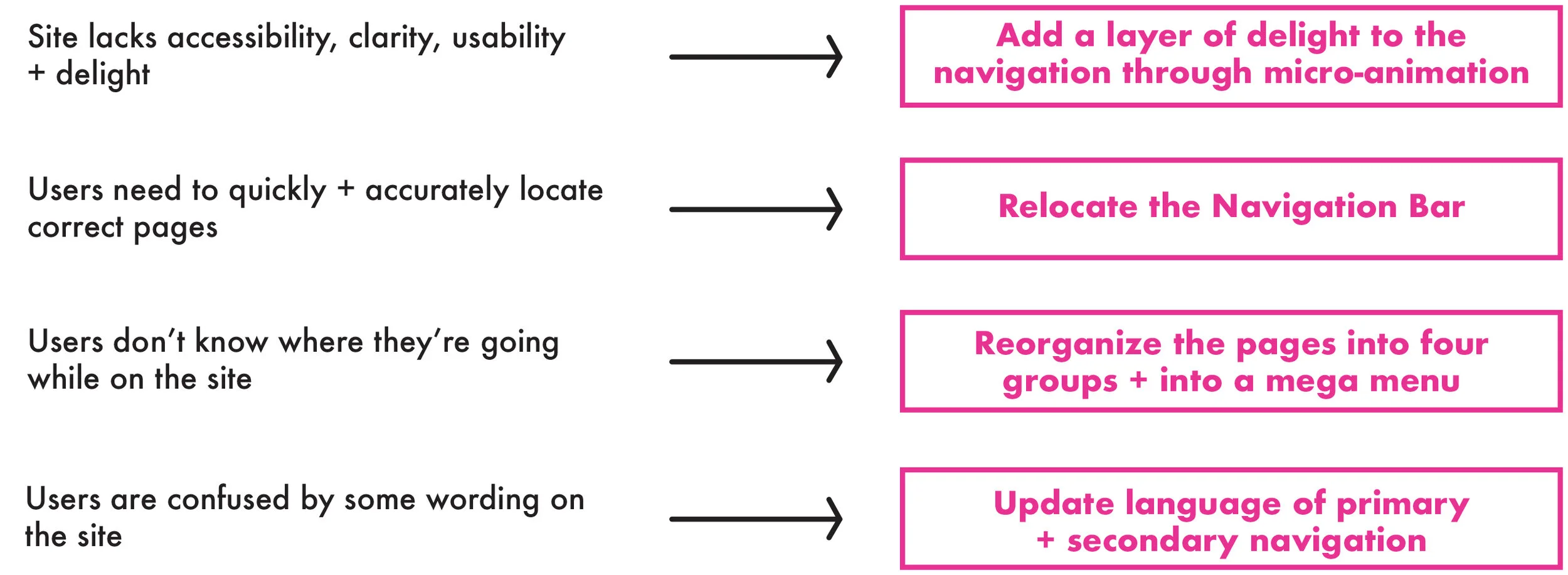
After going through four of the site’s pages, and analyzing using Abby’s Heuristics, we noticed that while the site feels credible and the information within has value, the site lacks accessibility, clarity, usability, and delight.

RESEARCH TESTING INSIGHTS
Through the overall results from testing the existing site, we decided to focus on the following proposed changes in our redesign:
DESIGN

In our proposed design, we moved the navigation bar to the top of the page, narrowed down the primary navigation to be four categories instead of six, and showcase an ability to buy tickets directly from the homepage.

You can see that the existing site has a left hand nav bar, six primary categories, and no way to buy a ticket from the home page.
In our proposed design, we moved the nav bar to the top of the page, narrowed down the primary to be four categories, and showcase an ability to buy tickets.

Despite the groupings being a bit larger in the redesign since there are only four Primary Navigational categories, they’re based on the navigational tests and the data received, so we know that the groupings are based in data from user feedback.
PROTOTYPE
TRY ME OUT!
TESTING THE REDESIGN
Once we had a redesign in mind, we started testing with users using the same methods we used with the existing site.
Tree Study

When comparing the two rounds of testing, we are able to see an increase in success ranging from 4%-10%, as well as the average time per task decrease by 5.81 seconds. This shows that the overall proposed changes to the site would be more easily navigated by users.
Overall, users averaged placing the secondary and tertiary navigation tier titles correctly inside the proposed categories 71% of the time. This is a 24% increase in correctly placing items into the navigational categories, showing that with our proposed navigational structure, users would be able to find what they are looking for easier than they are able on the current site.

NEXT STEPS
Through testing our proposed design, we were able to prove that our user generated data was pretty spot on in regards to what needs to be edited on the existing site. For next steps, we’re interested in adding an accessibility option to the site, and completing a few rounds of usability testing and edits before launching the proposed changes within the Guggenheim site.

Hopefully by implementing these proposed changes, the Guggenheim site will continue to be fun, sleek, and modern; all while being easily used by visitors.